SUMMER 23/24 INSPIRATION:
THE GELATO COLOURS OF PROCIDA
Shimmering in pink and gold, mirage-like across a glittering sea, an island appeared. I was on a ferry from Naples to Ischia. A mumbled “Mi scusi Signora”, and pointing to it, I gained the reply: “Procida”.
A tiny jewel in the sea, so easily overlooked, but not by the Mycenaeans in the 16th Century B.C.E, nor the Greeks from Cuma. The nobles from the Roman Empire used it as a holiday resort. Located in the midst of key trading routes, it has been invaded by Normans, Goths, and Saracen pirates, then more recently by the film crews of
“Il Postino” and “The Talented Mr Ripley”, and then shortly after my first sighting, by me-fully armed with my bijou watercolour box and brushes.
I was soon wandering amongst the old pastel-coloured houses, fascinated and enchanted by the architecture: a vernacular architecture of houses leaning against each other, on top of and around each other, with outside steps that become neighbours’ balconies: a mishmash born of necessity designed to confuse those invading Saracen pirates, whilst allowing escape routes for the inhabitants.
A distinguishing feature being the “vefio”, a small balcony covered by an arched vault, reminiscent of the Moorish world.
I asked a fisherman, who had finished work for the day and hung up his nets, if, for a small fee, he could take me out in his boat, a colourful liquorice all-sort of pink, yellow and white. It turned into a delightful trip with an impromptu simple lunch , bobbing about in the gentle sea, making little watercolour sketches of the charming tumble of gelato coloured houses in the bay of Corricella.
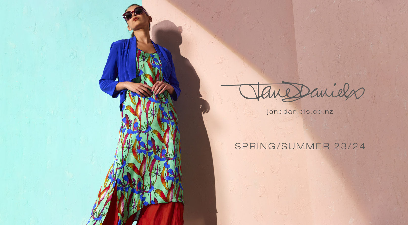
These colours on Procida ( Pro-chee-dah) have inspired my colour palette for this season, along with some smoky off- beat darks as a balance. I have fused these with other design influences: a soft-shell pink on silk satin in a vintage floral, traditional Uzbek designs that have been recreated in soft pastels, and I have created some colour combinations with watercolours on prints that hint at Japonisme. One is of lotus blossoms and matsu (pine trees), another of sakura (cherry blossoms).
A beautiful Oriental landscape scroll design is in a deep purply navy.
The fabrics include European linens and silks and Italian appliqués and travel friendly crinkle pieces and Eurojersey. In styling there is some asymmetrical, some origami and some layering, and filmy georgette overlays of splits on pants and dresses, a natural evolvement from popular existing styles. Jacket shapes include the blazer, tux, collarless and bolero. Special-occasion dresses all have sleeves, or thought-out jacket options, dresses can double as coats, and there are many casual weekend and travel pieces.
Always effortlessly elegant and easy to wear… Looking forward to a great summer.


